The Green Dot
Symbolising a Greener Planet
Symbolising a Greener Planet
SCOPE OF WORK
Brand Identity Design
Digital Design
Packaging
Brand Identity Design
Digital Design
Packaging
UN SUSTAINABLE DEVELOPMENT GOALS


CONTEXT
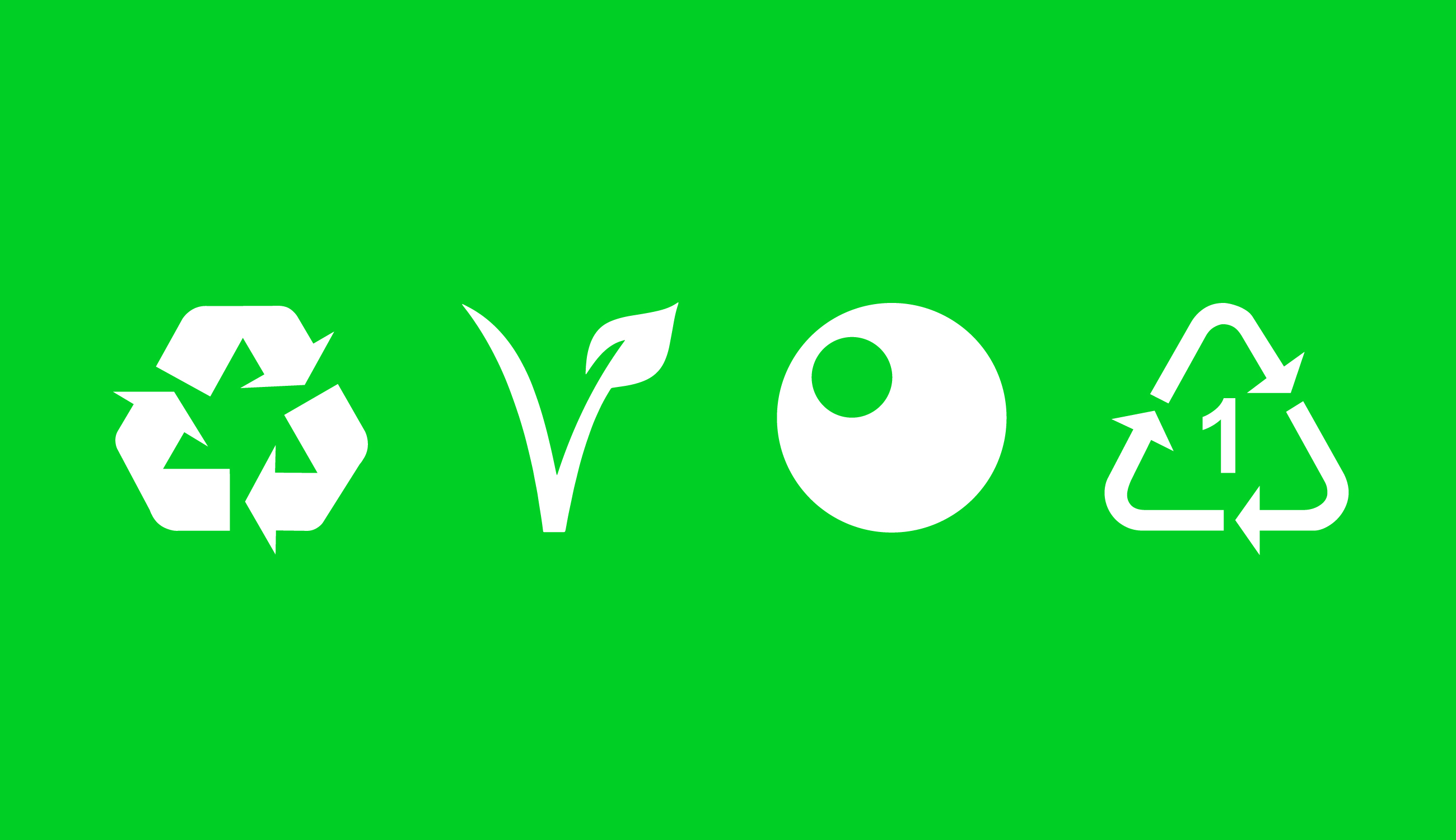
In use by 130,000 companies and appearing on 460 billion packages each year, the Green Dot is the financing symbol for the organisation of recovery, sorting and recycling of sales packaging in Europe. The Green Dot packaging means a financial contribution has been made to a qualified national packaging recovery organisation, but it does not mean recycle, recycled or recyclable. The Green Dot symbol adopts the same motif as the recycling symbol, and due to this, has lead to confusion and widespread recycling contamination. MEK was invited by climate initiative TwoºCreative to redesign it.


Our design incorporates a green circle representing Earth and a white circle mapping Europe where the symbol is mostly used. The symbol is quick and easy for people to understand as a shorthand icon while being scalable and adaptable across a range of materials from outdoor advertising to packaging.

 Shopping bags from a supermarket in Naarm/Melbourne, incorrectly using the Green Dot logo to signify the bags as being recyclable.
IMPACT
The boldness of the symbol is designed to attract attention and encourage conversation. Its simplicity builds recognition, facilitating informed purchasing decisions that contribute to change.
The boldness of the symbol is designed to attract attention and encourage conversation. Its simplicity builds recognition, facilitating informed purchasing decisions that contribute to change.
The Green Dot redesign demonstrates the power of transformative design in truth and storytelling; conversely highlighting the damaging, negative impact of design when used carelessly without strategy or consideration.