


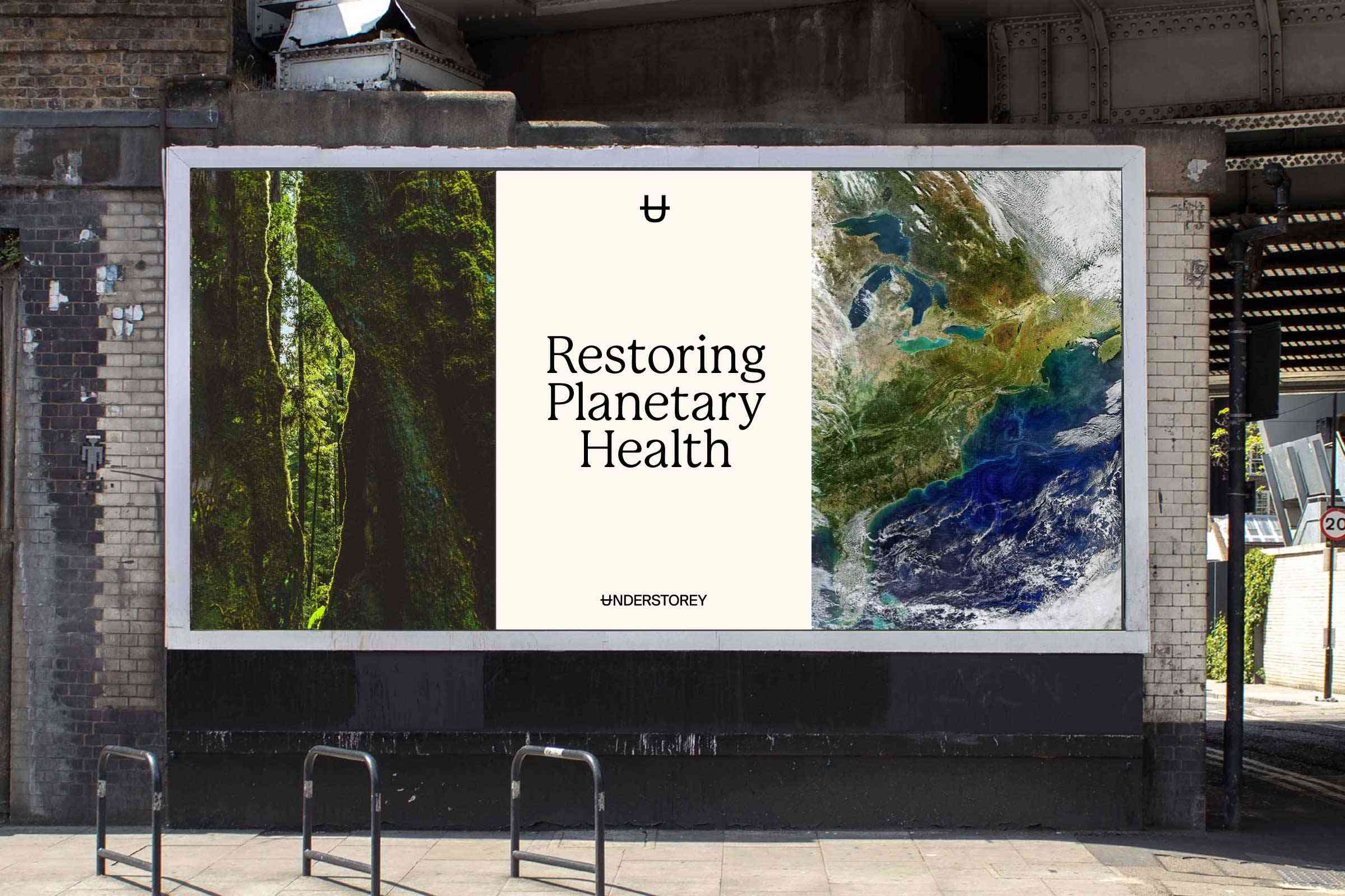
Understorey
Restoring Planetary Health
SCOPE OF WORK: STRATEGY
Vision & Mission
Brand Positioning
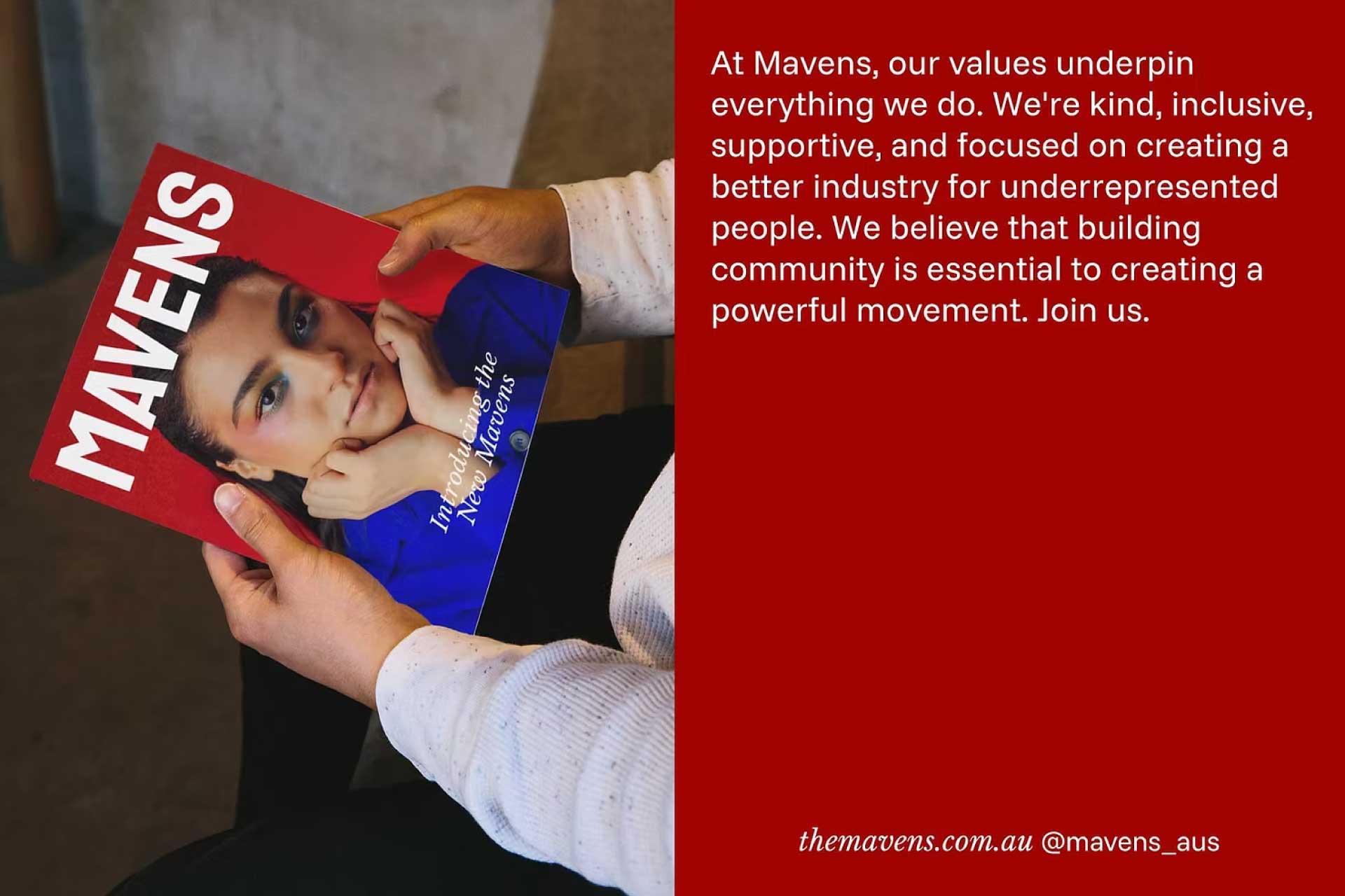
Brand Values
Brand Purpose
Brand Messaging
Brand Idea
Brand Story
Vision & Mission
Brand Positioning
Brand Values
Brand Purpose
Brand Messaging
Brand Idea
Brand Story
SCOPE OF WORK: IDENTITY
Verbal Identity
Brand Identity
Visual Language
Design System
Copywriting
Brand Guidelines
Verbal Identity
Brand Identity
Visual Language
Design System
Copywriting
Brand Guidelines


CONTEXT
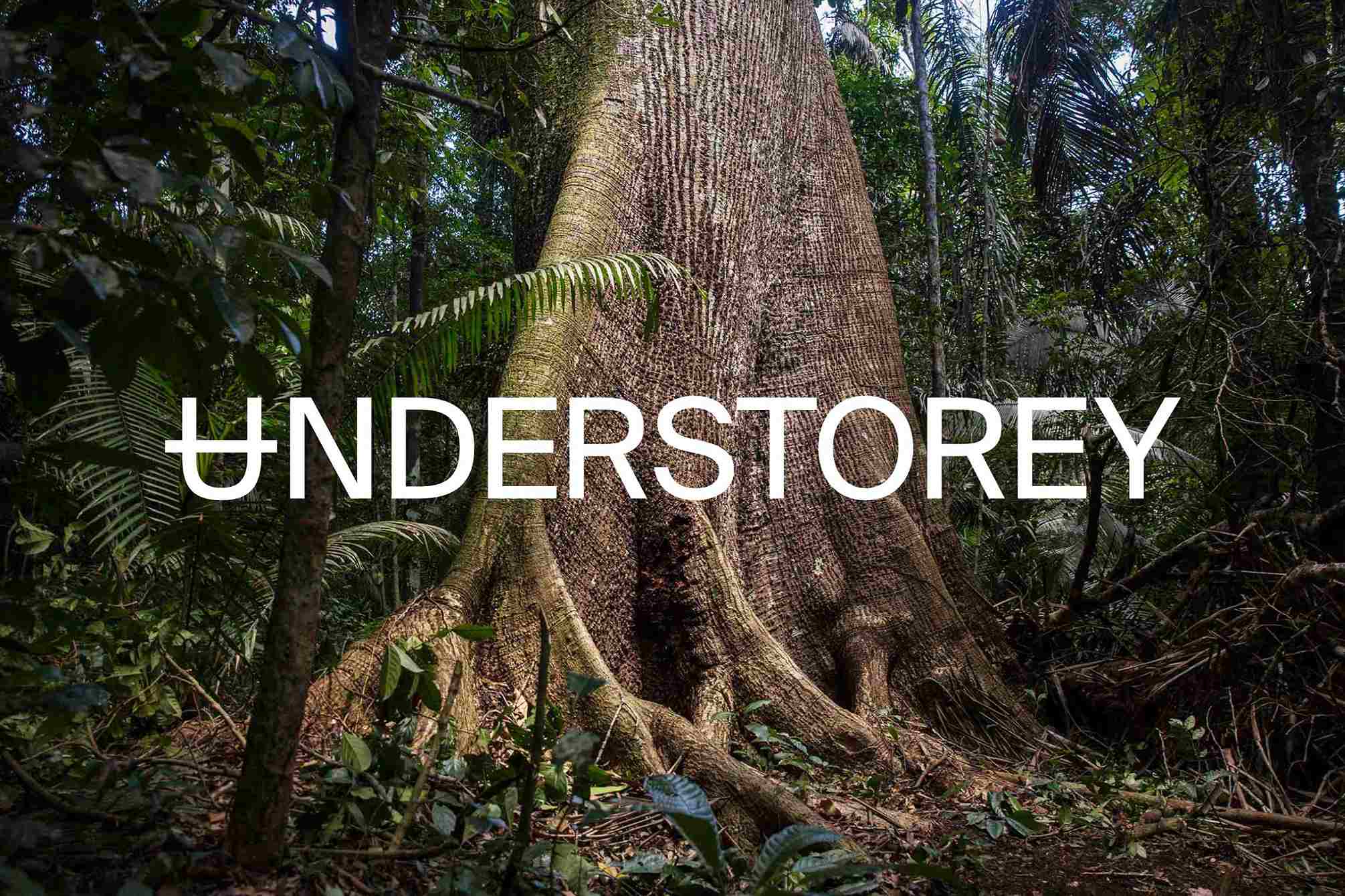
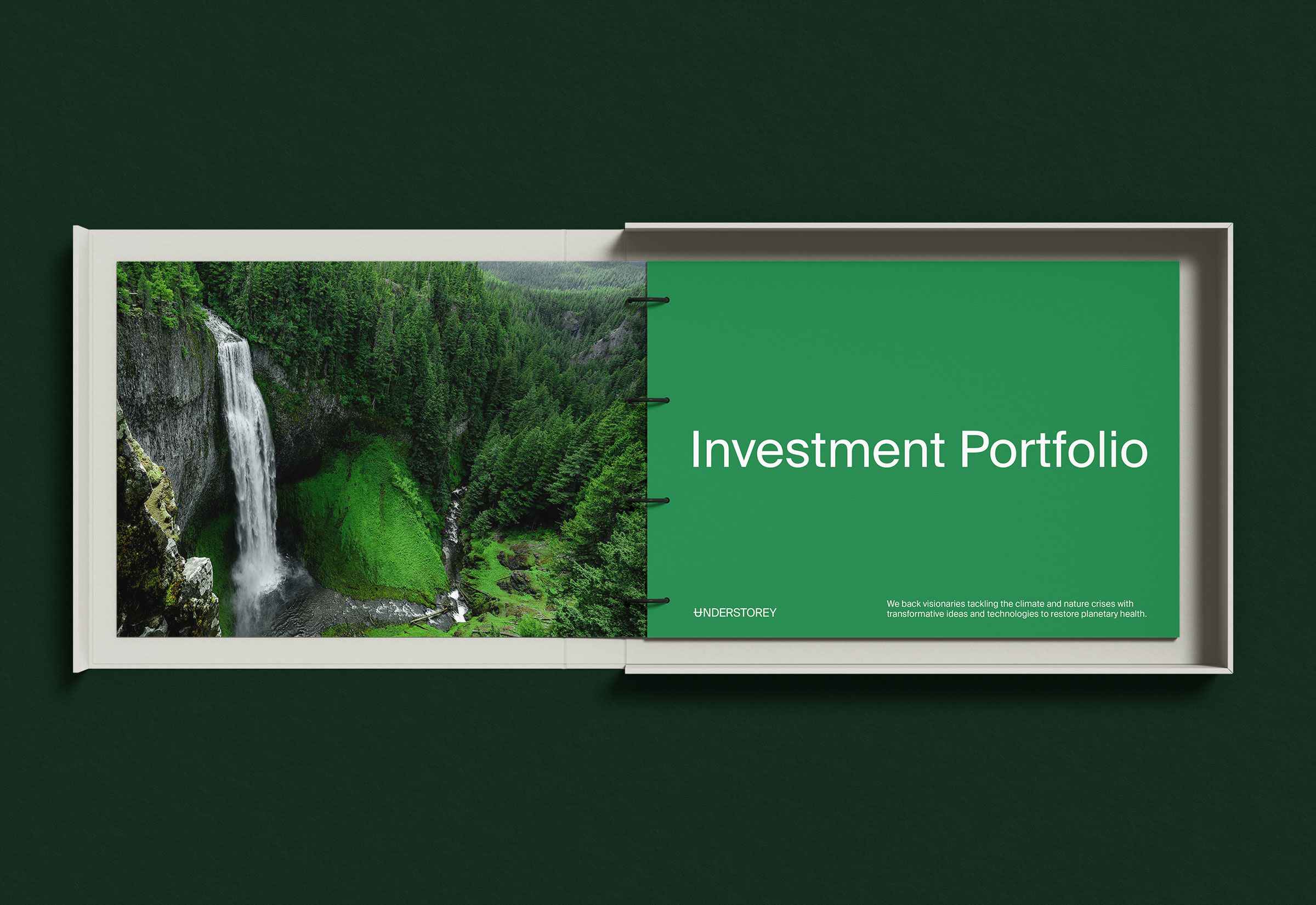
Understorey is an impact investment company investing in critical solutions by visionaries tackling the climate and nature crises with transformative ideas and technologies, guiding humanity towards a net positive impact on nature. It seeks to help restore planetary health and support a regenerative society that’s just, inclusive, and conscious of all living things. MEK was engaged to build a brand from the ground up to support this vision, leading with impact-led strategy.

APPROACH
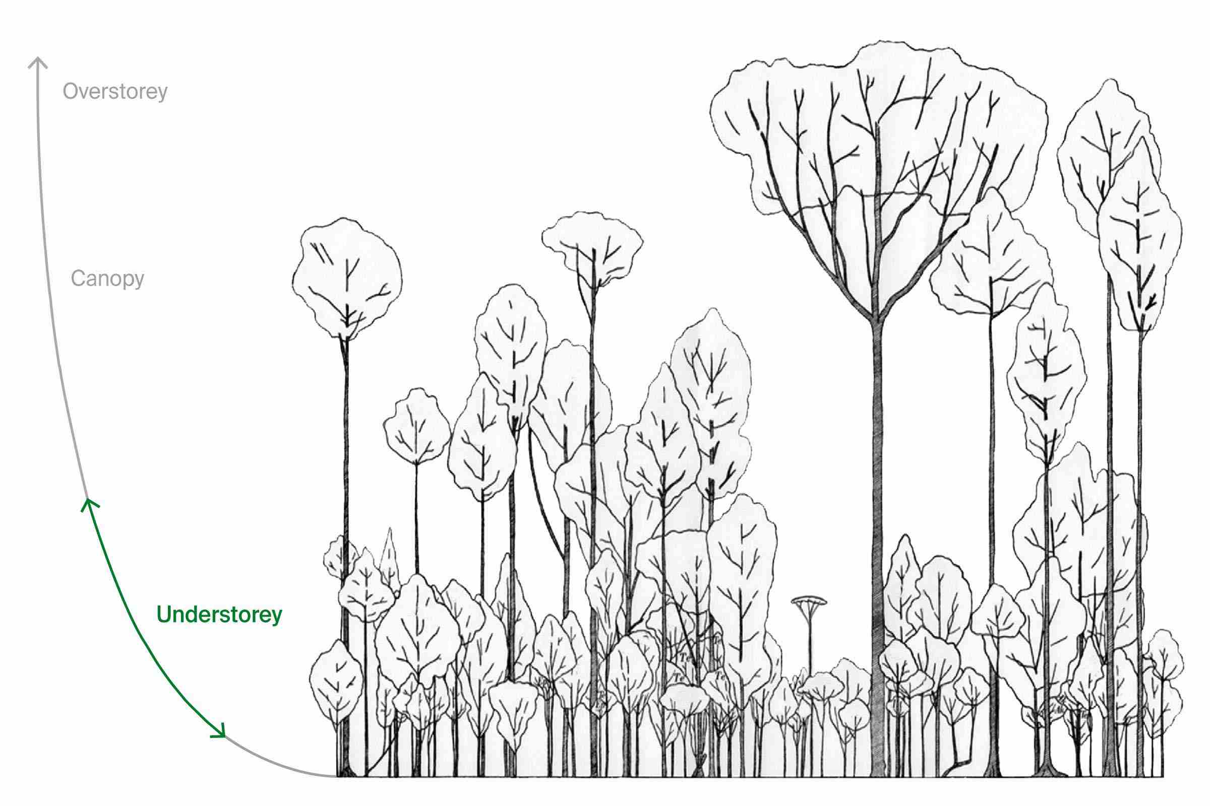
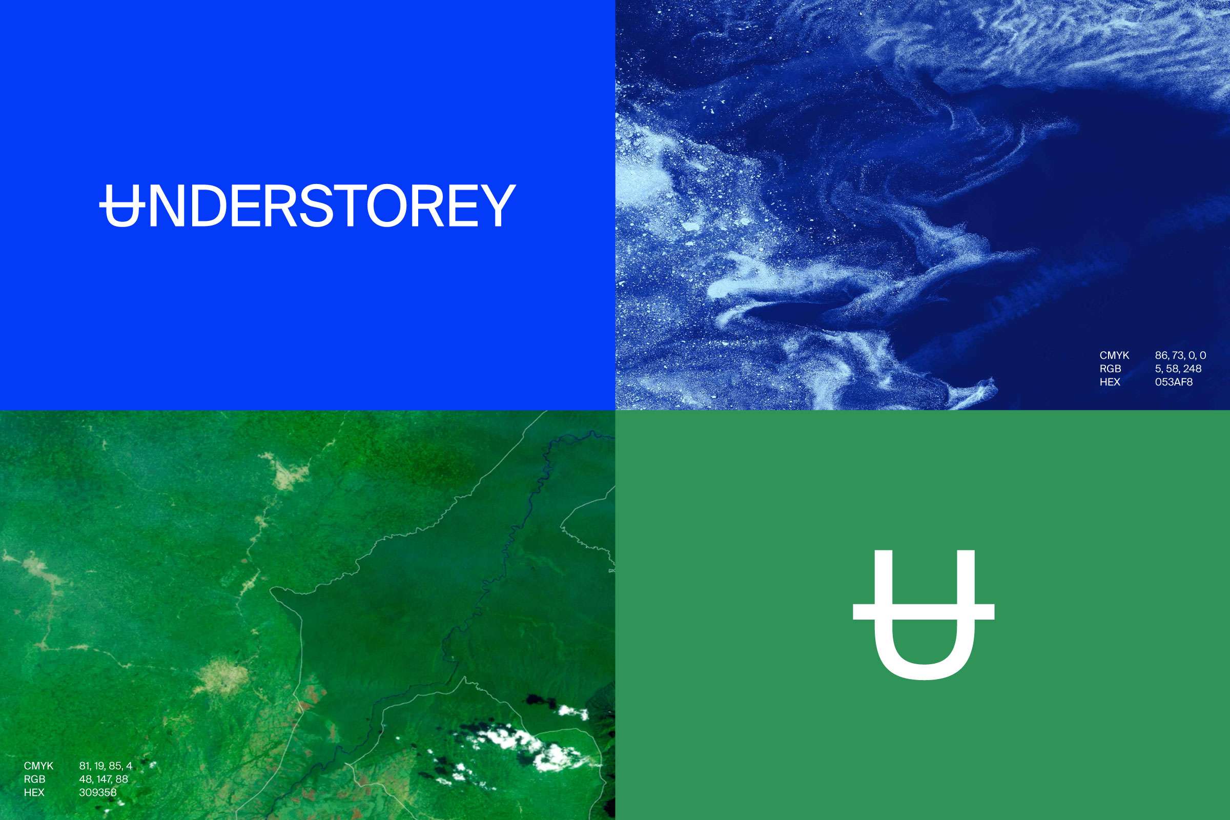
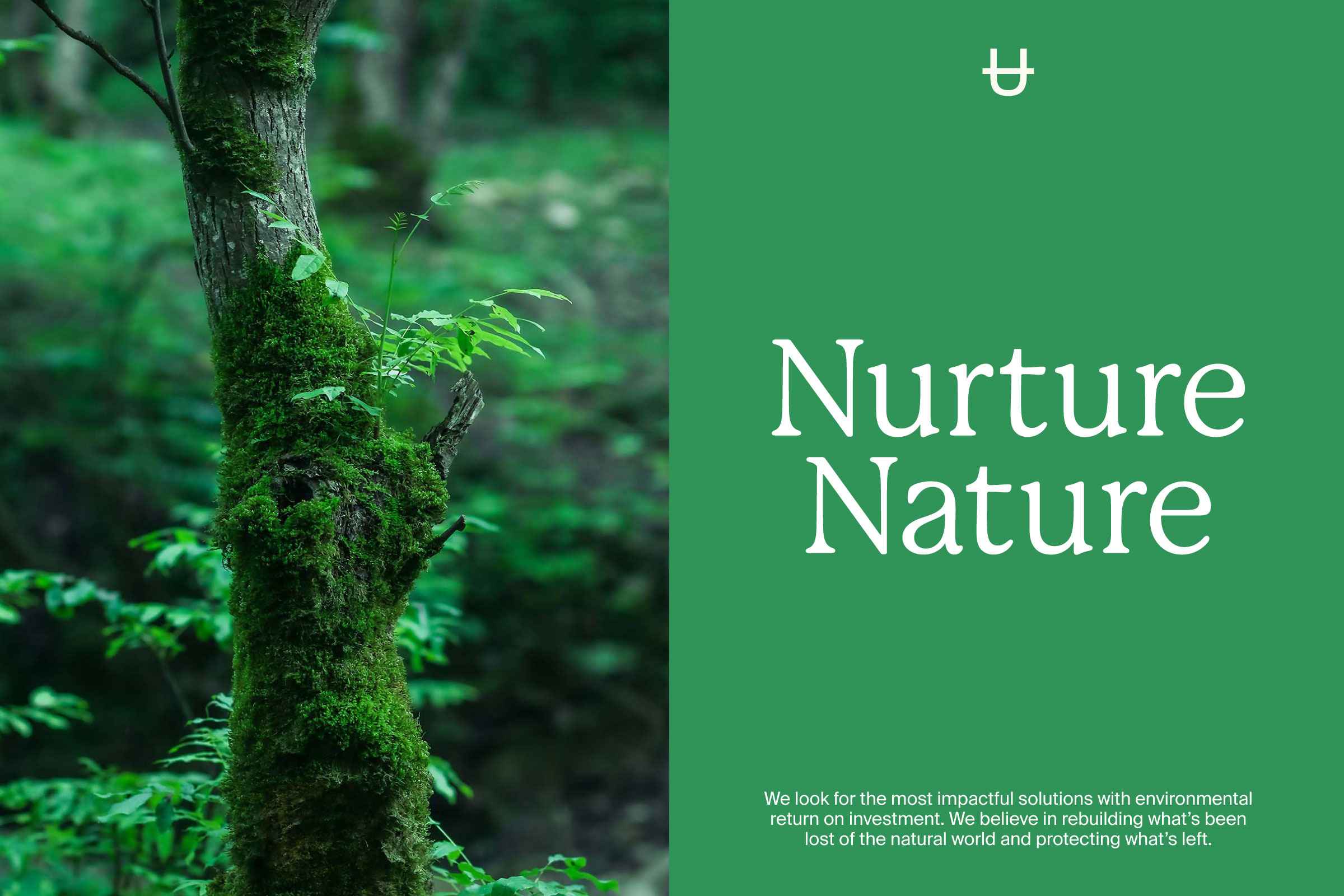
Through our strategy process the core brand idea emerged: micro/nature and macro/climate. For micro/nature we focused on anthocyanins—the red, blue and purple pigments found in forest understorey plants that help increase photosynthetic efficiency. For macro/climate we focused on Earth’s five major subsystems: atmosphere, biosphere, cryosphere, geosphere and hydrosphere. When these spheres all interact with each other, they form the global climate system.
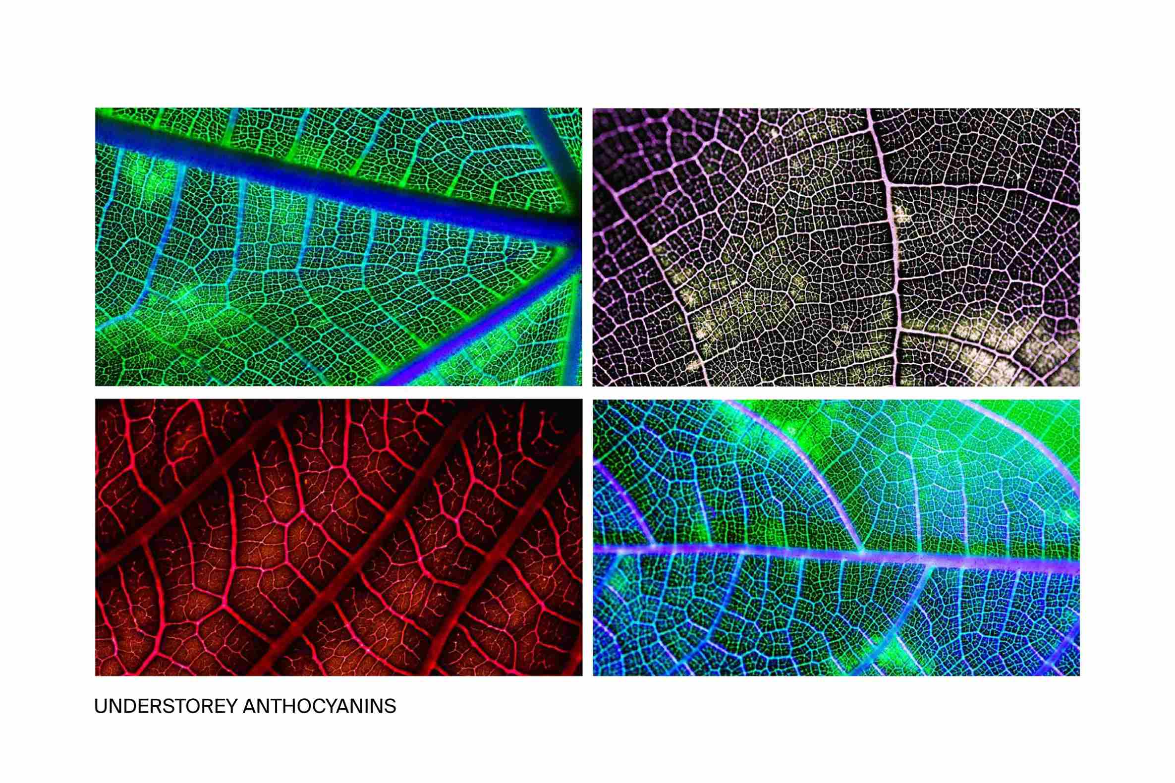

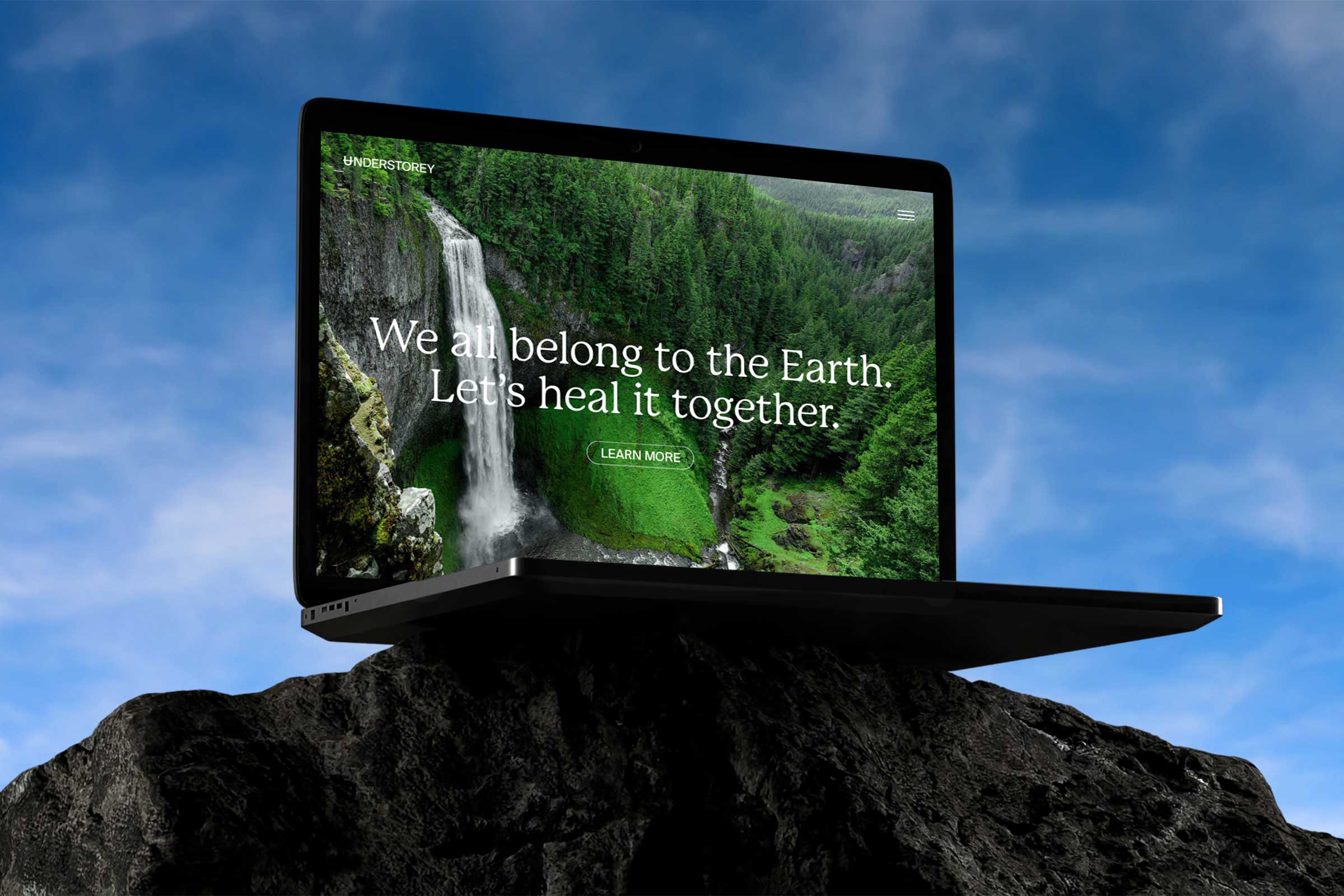
The brand idea became the foundation for Understorey’s visual and verbal identity. The brand mark references the elemental symbol for earth (micro/nature), NASA’s solar system symbol for Earth (macro/climate), and the area of the understorey in the forest. We created a visual language that heroes the interconnected relationship between nature and climate. The colour and icon systems are derived from the symbiosis of understorey anthocyanins and Earth subsystems.


IMPACT
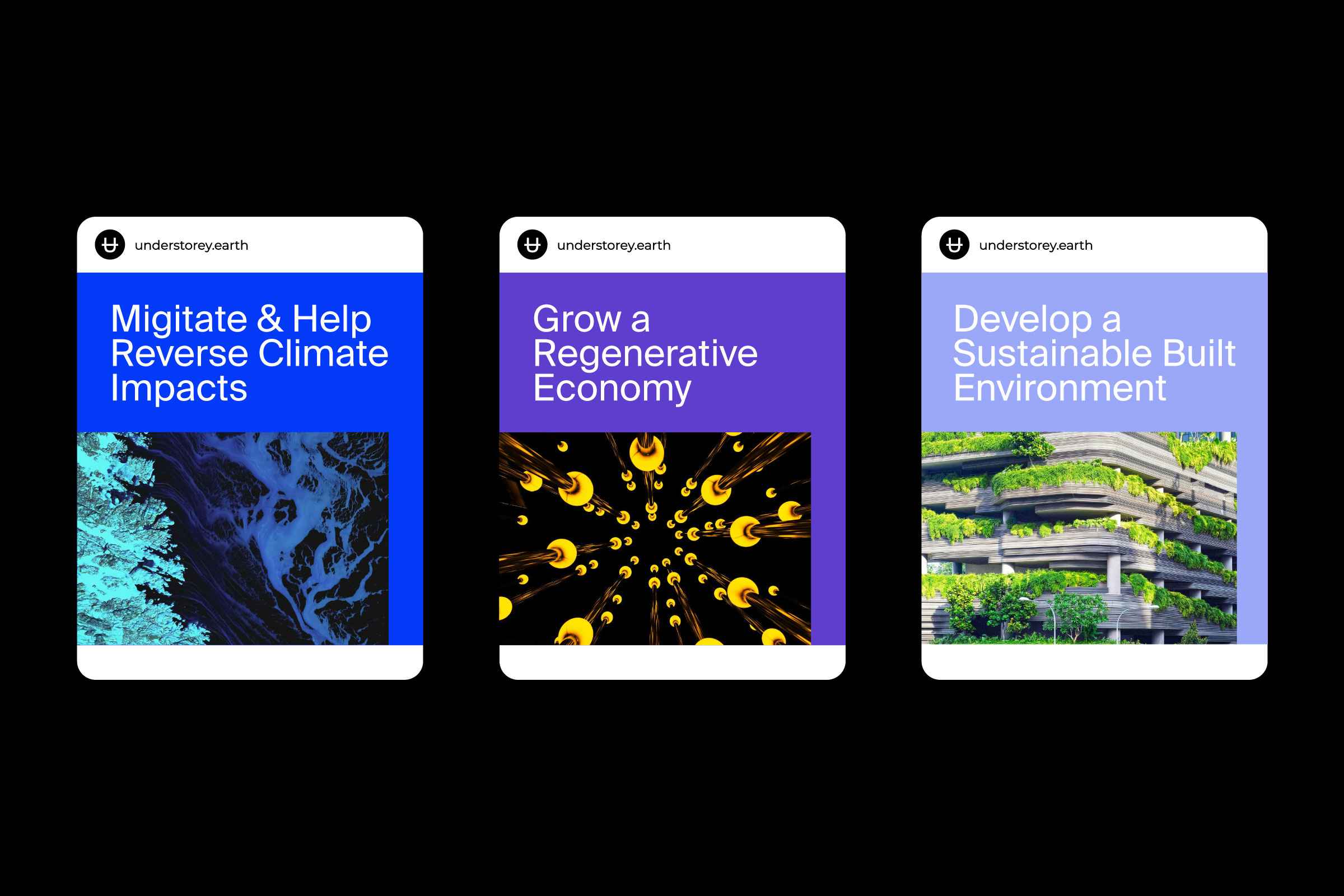
The identity positions Understorey as a leader in impact investment addressing the duality of the nature and climate crises. It supports the company’s investment values and service sectors in biosphere, food systems, circular economy, environmental data and finance, and sustainable cities.


The brand disrupts the impact investment category with a unique, impactful identity synonymous with innovation yet uncommon in the B2B nature and climate space. It conveys a hopeful future with a compelling narrative that supports Understorey’s motivation of unlocking abundance and prosperity for people and the planet by using science and systems design inspired by nature.

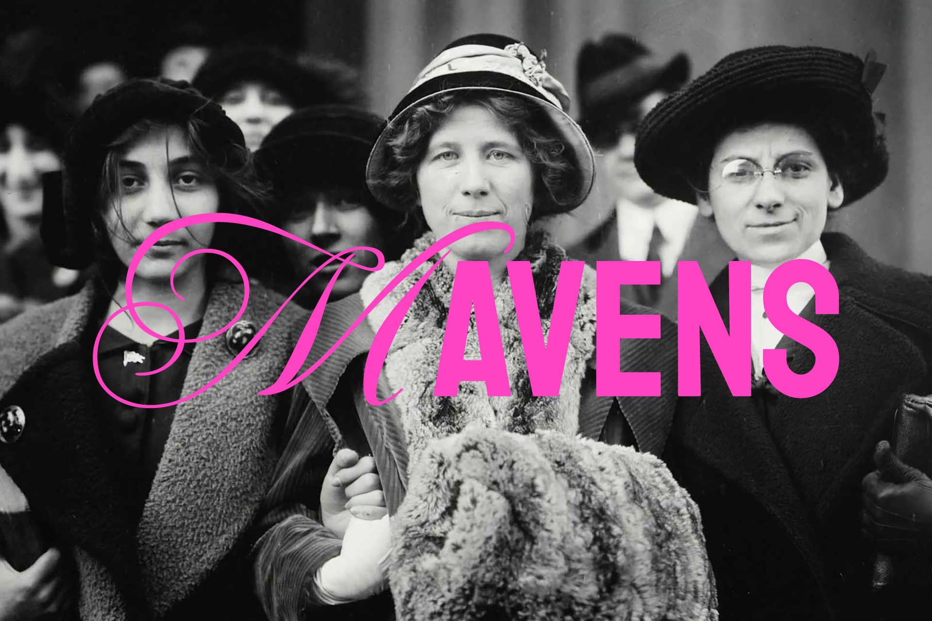
Mavens
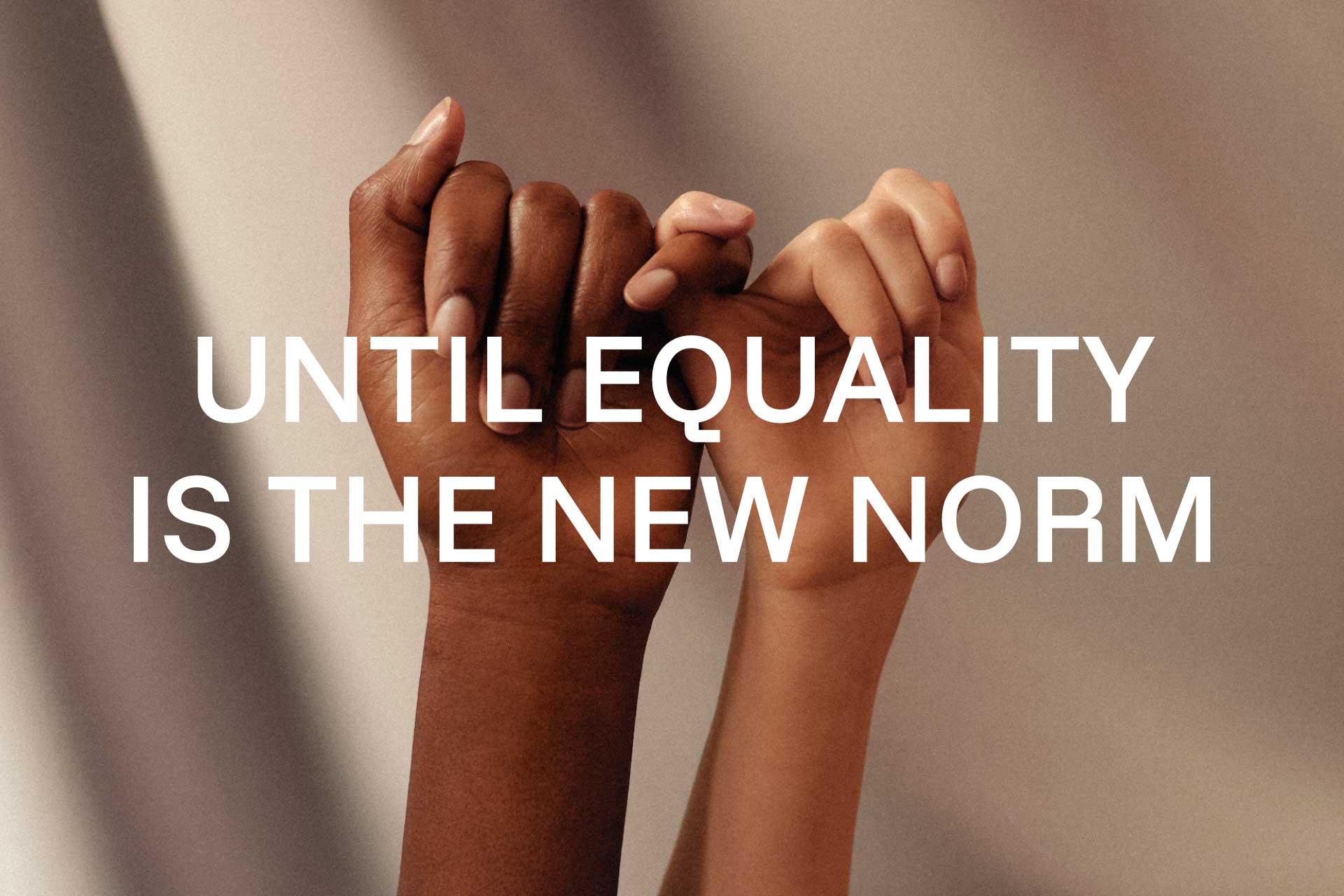
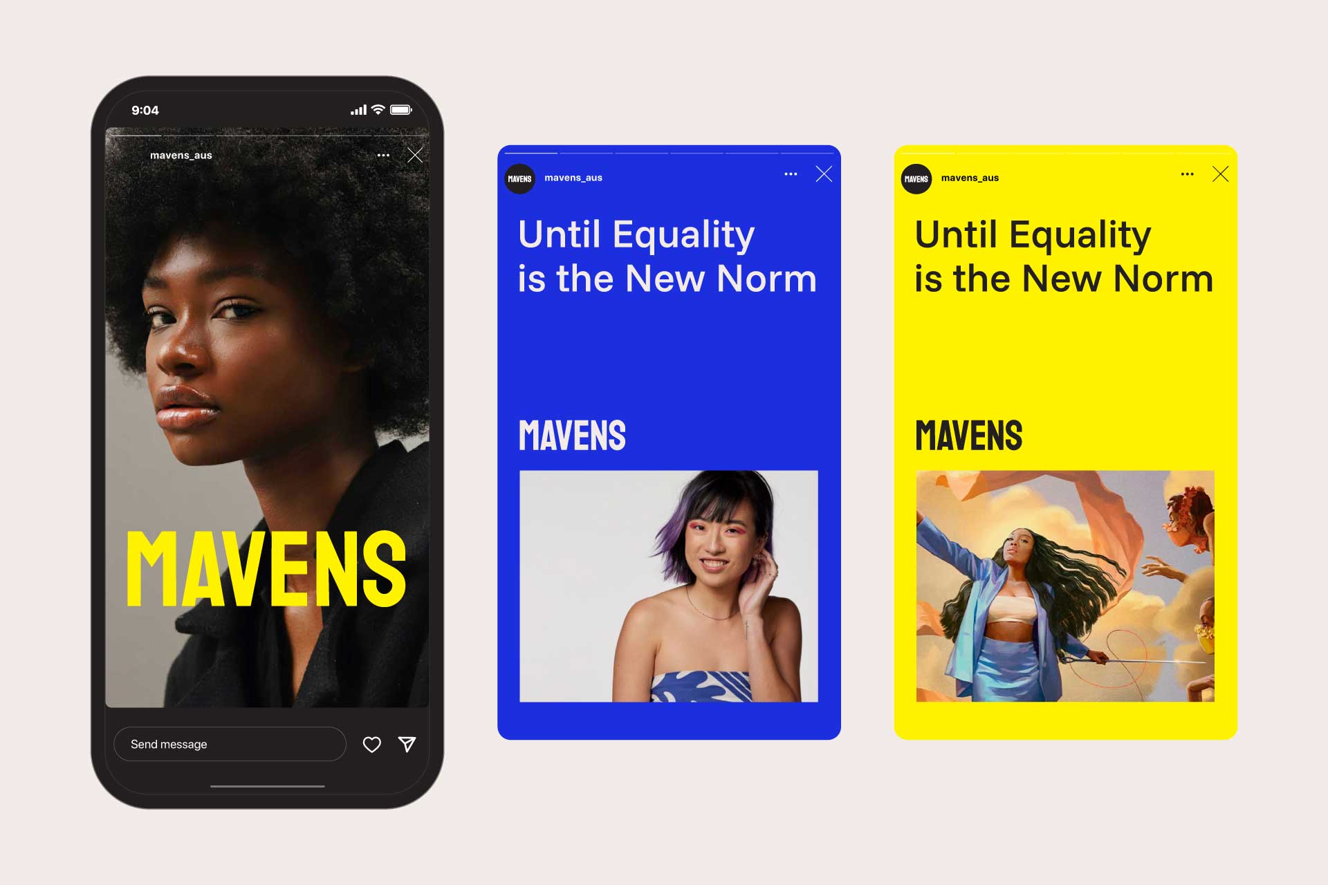
Until Equality is the New Norm
SCOPE OF WORK:
STRATEGY
Vision & Mission
Brand Positioning
Brand Values
Brand Purpose
Brand Messaging
Brand Idea
Brand Story
STRATEGY
Vision & Mission
Brand Positioning
Brand Values
Brand Purpose
Brand Messaging
Brand Idea
Brand Story
IDENTITY
Verbal Identity
Brand Identity
Visual Language
Brand Guidelines
Verbal Identity
Brand Identity
Visual Language
Brand Guidelines

CONTEXT
Mavens is on a mission to redefine equality in the communications industry. After five years as a leading print and digital media platform, it was time for it to evolve into a movement for change. This (r)evolution needed a complete rebrand, from verbal and visual identity to strategy and positioning. MEK was engaged to develop a brand that moves people from the sideline to the frontline.
Mavens is on a mission to redefine equality in the communications industry. After five years as a leading print and digital media platform, it was time for it to evolve into a movement for change. This (r)evolution needed a complete rebrand, from verbal and visual identity to strategy and positioning. MEK was engaged to develop a brand that moves people from the sideline to the frontline.


APPROACH
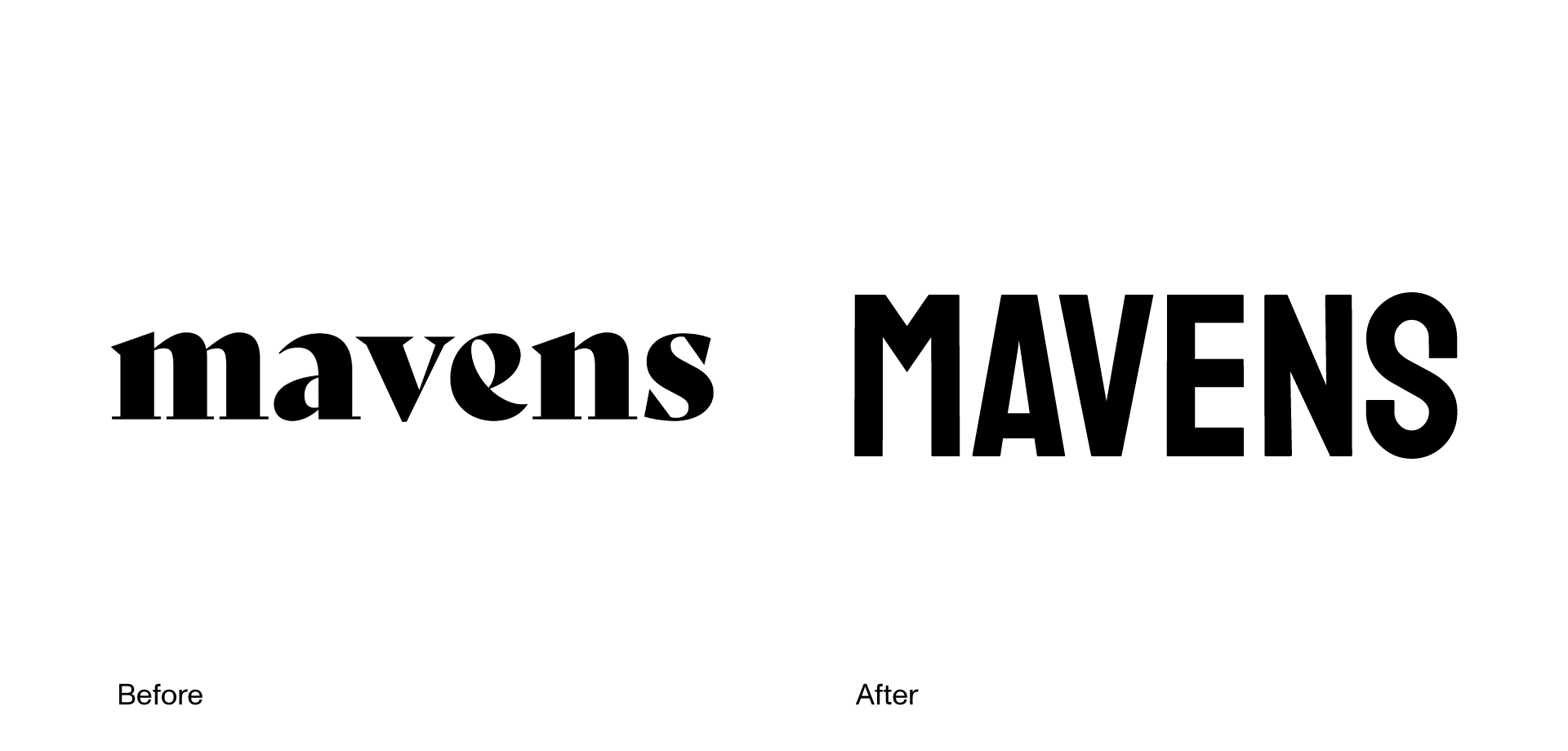
Through our strategy process the brand idea emerged: punk meets prestige. We developed a verbal and visual identity that embodies the rebellious spirit of the punk subculture with the refined elegance and cultural influence of iconic print publications, honouring Mavens’ storytelling roots through digital and print mediums. Each design element was chosen to convey this duality: traditional colours juxtaposed with dynamic accents, authoritative typography with unconventional proportions, and classic editorial layouts with contemporary design. This balance between disruption and sophistication created the unique brand idea—one that honours editorial excellence while challenging conventions, resulting in an identity that’s both authoritative and unapologetically original.

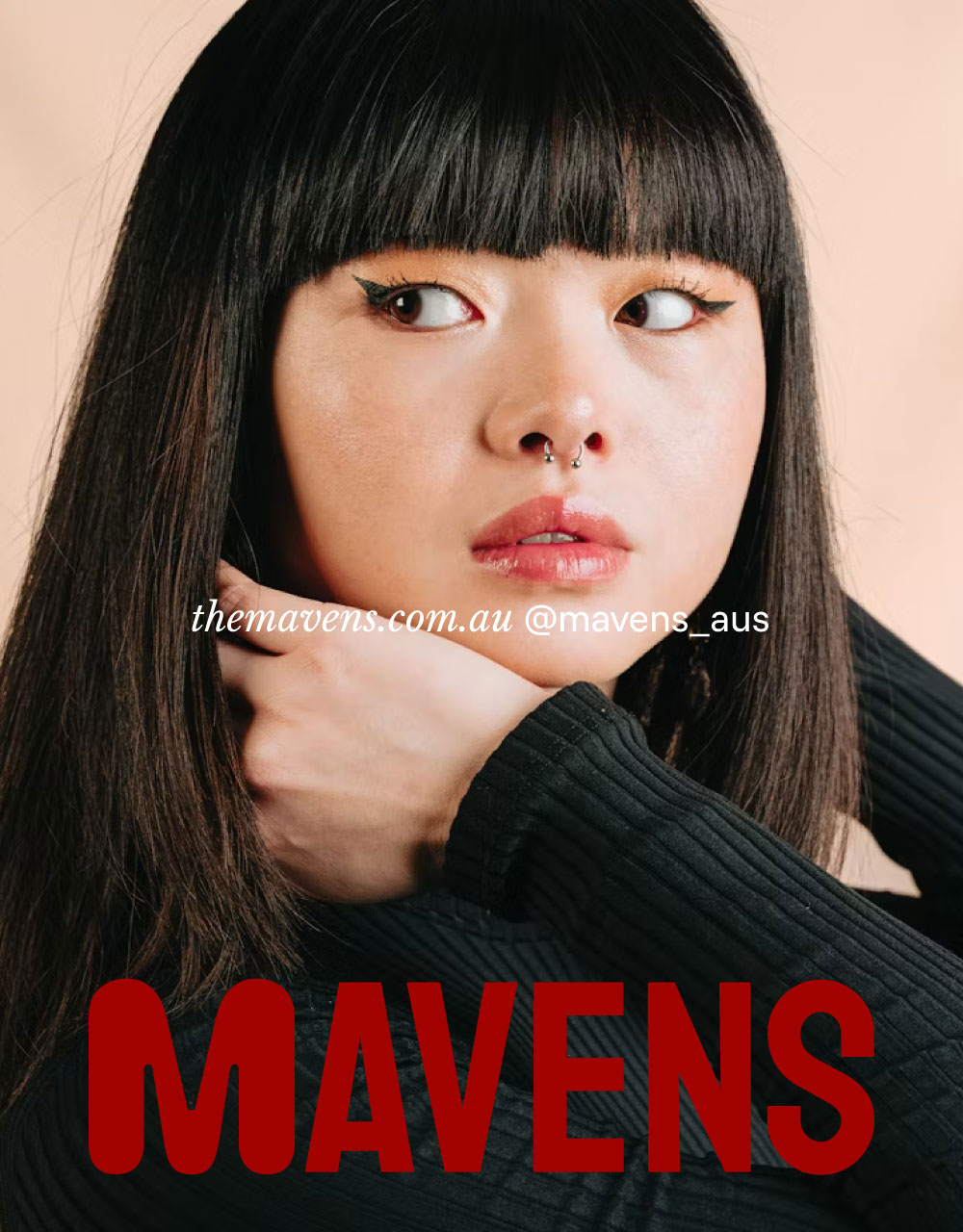
We developed a bold visual language built around distinct ‘M’ letterforms with each representing the rich diversity of marginalised voices. These variations reflect different identities, experiences, and expressions—reinforcing the movement’s commitment to equality across all walks of life. Beyond conventional typographic choices, this system challenges uniformity and embraces individuality, resulting in a visual language that’s as multifaceted as the people it stands for.


IMPACT
The rebrand has repositioned Mavens from a platform for discussion to a powerful movement for change. By aligning its identity with its mission, it now communicates a stronger sense of purpose and authority. This transformation has deepened connections with underrepresented communities, engaged allies and industry stakeholders, and amplified the movement's relevance and commitment to defying established values. By bringing strategy and impact to the forefront of our creative process, we've helped Mavens evolve into a leading force for equality—one that goes beyond advocating for change to actively creating it.
The rebrand has repositioned Mavens from a platform for discussion to a powerful movement for change. By aligning its identity with its mission, it now communicates a stronger sense of purpose and authority. This transformation has deepened connections with underrepresented communities, engaged allies and industry stakeholders, and amplified the movement's relevance and commitment to defying established values. By bringing strategy and impact to the forefront of our creative process, we've helped Mavens evolve into a leading force for equality—one that goes beyond advocating for change to actively creating it.


“Working with MEK was transformative. They didn’t just create a brand, they helped shape a movement. Their strategic and intuitive approach translated our vision into something more powerful than we could imagine, providing both a roadmap and launchpad for real impact. From day one they made our mission their own, bringing an extraordinary depth of understanding and care that made their collaborative process seamless and deeply meaningful. The final result stays true to our story while elevating our message, giving us the clarity and confidence to push our mission forward. MEK helped us build something that truly matters.”
LEAH MORRIS, FOUNDER & EDITOR, MAVENS


“We knew from the start that evolving Mavens from a magazine and content platform into a movement for equality would mark a powerful shift from simply raising awareness to actively creating change. What started as a space to share stories and ideas has grown into a dynamic force, uniting voices and building a community to challenge the status quo to advance its mission. By shifting focus from conversation to action, Mavens is now positioned to shape a future where equality is the new norm.”
MIRELLA ARAPIAN, EXECUTIVE CREATIVE DIRECTOR, MEK“We knew from the start that evolving Mavens from a magazine and content platform into a movement for equality would mark a powerful shift from simply raising awareness to actively creating change. What started as a space to share stories and ideas has grown into a dynamic force, uniting voices and building a community to challenge the status quo to advance its mission. By shifting focus from conversation to action, Mavens is now positioned to shape a future where equality is the new norm.”
Read about the creative process
Revival Projects
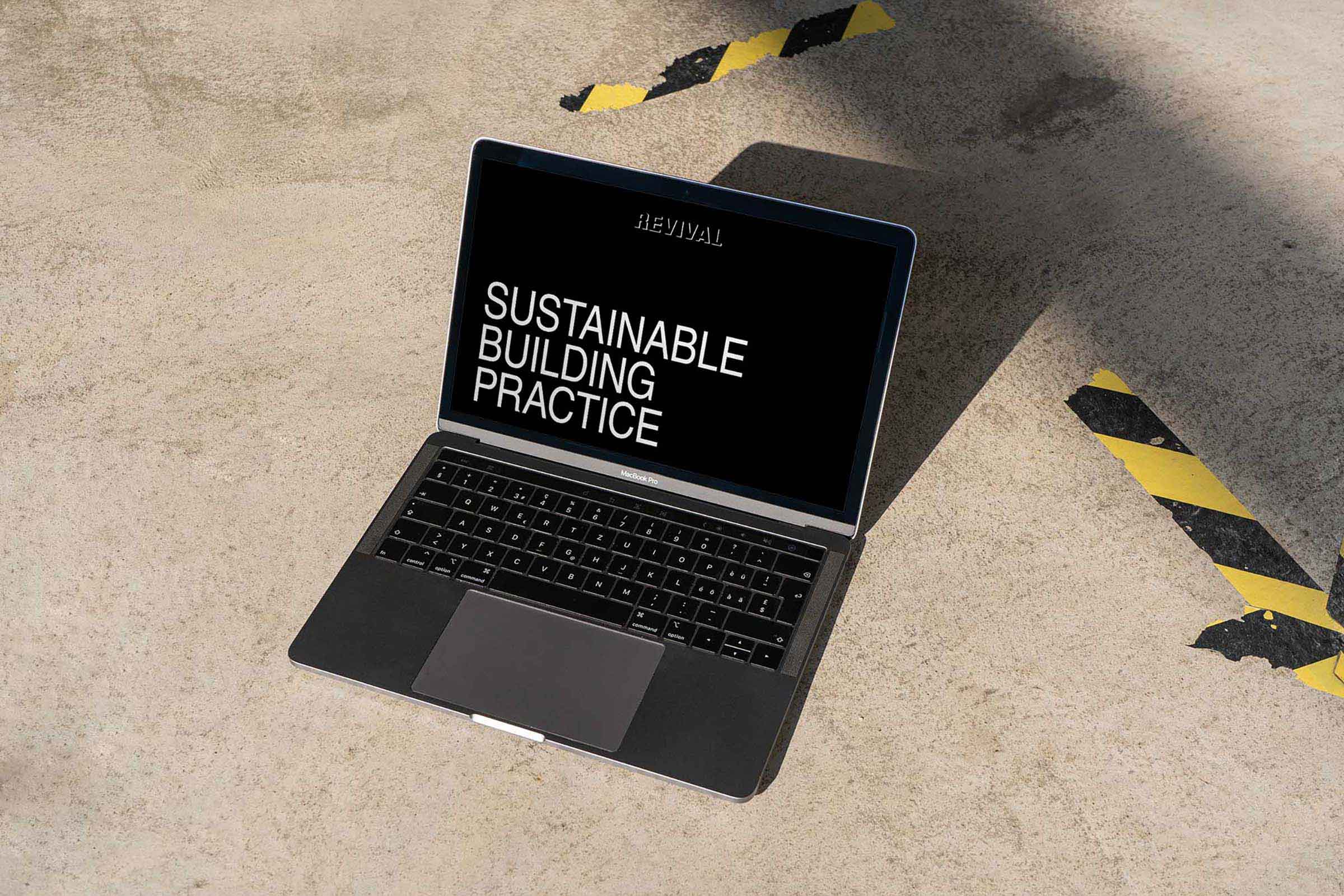
Revolutionising Sustainable Building Practices
SCOPE OF WORK
Website Strategy
Web Design
Digital Design
Website Strategy
Web Design
Digital Design
UN SUSTAINABLE DEVELOPMENT GOALS

PHOTOGRAPHY
Tom Graham
Tom Graham
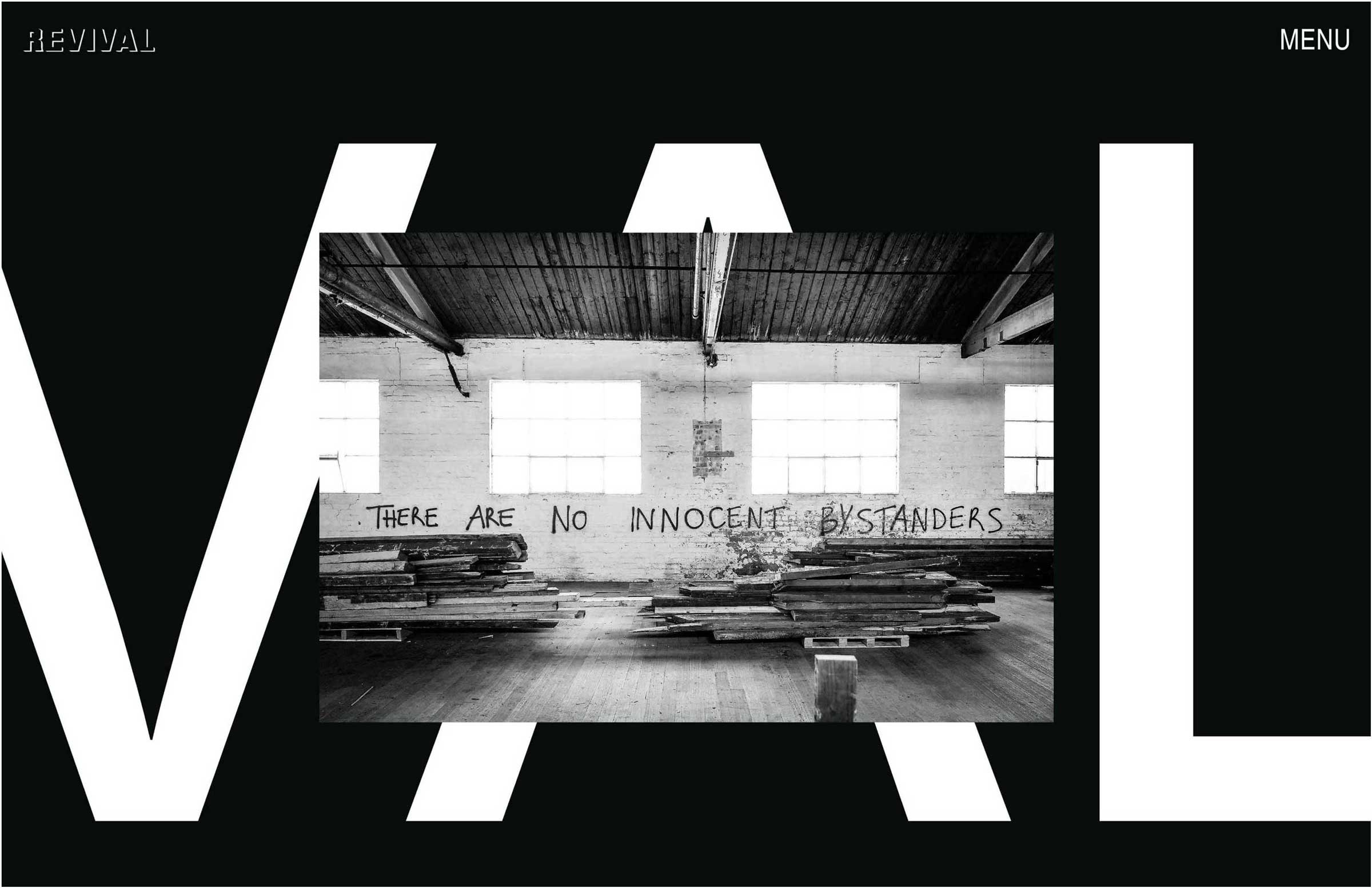
CONTEXT
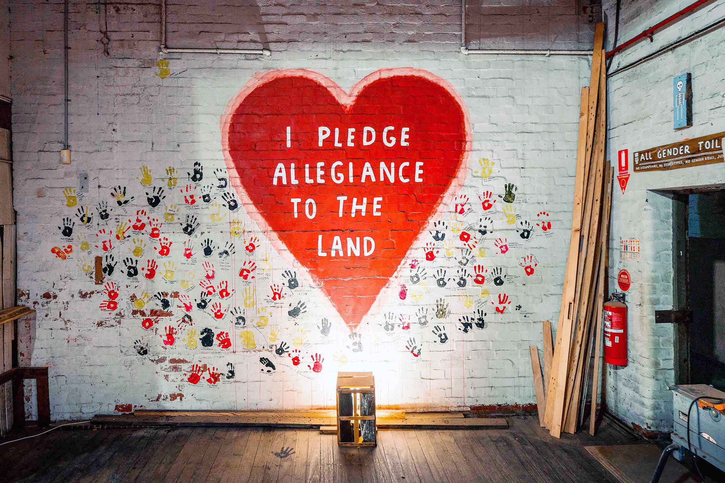
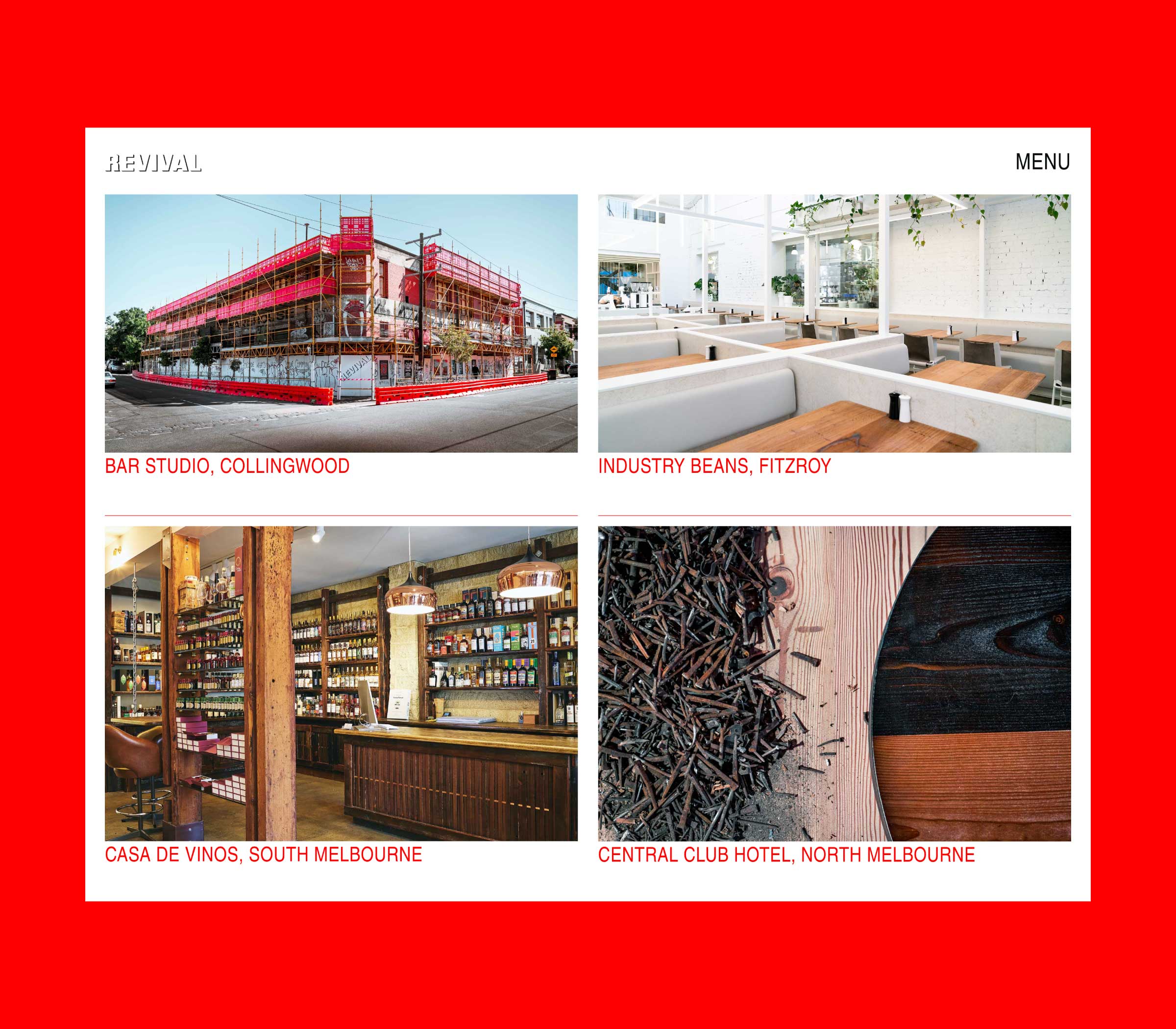
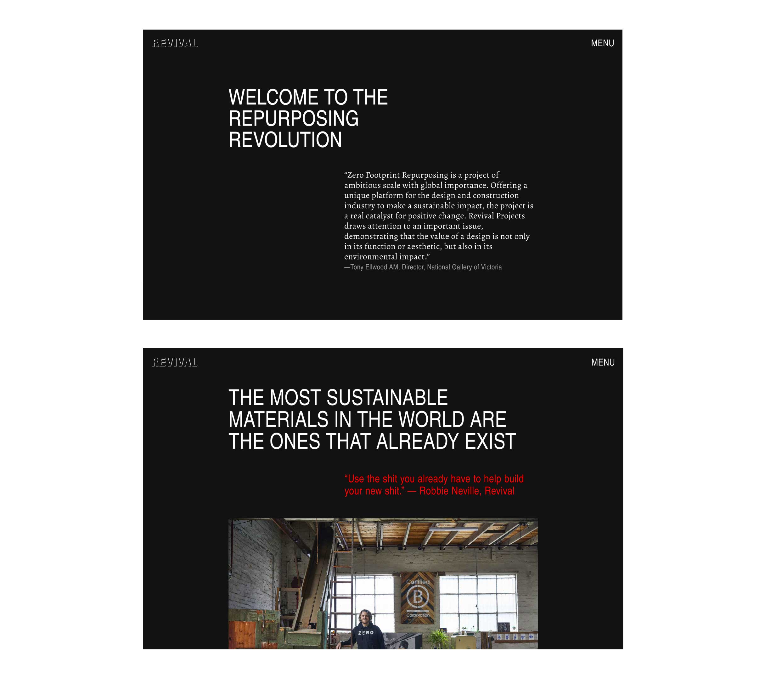
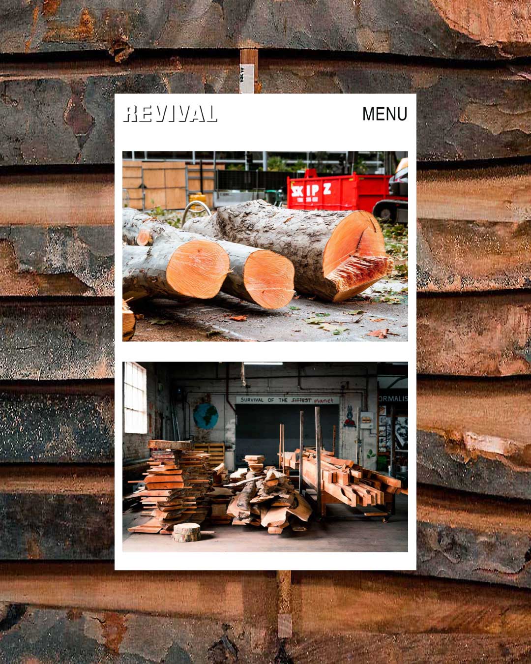
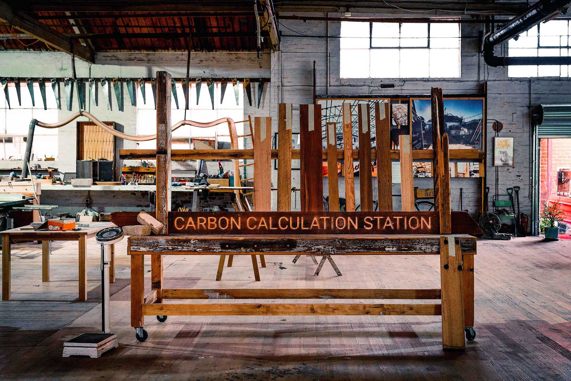
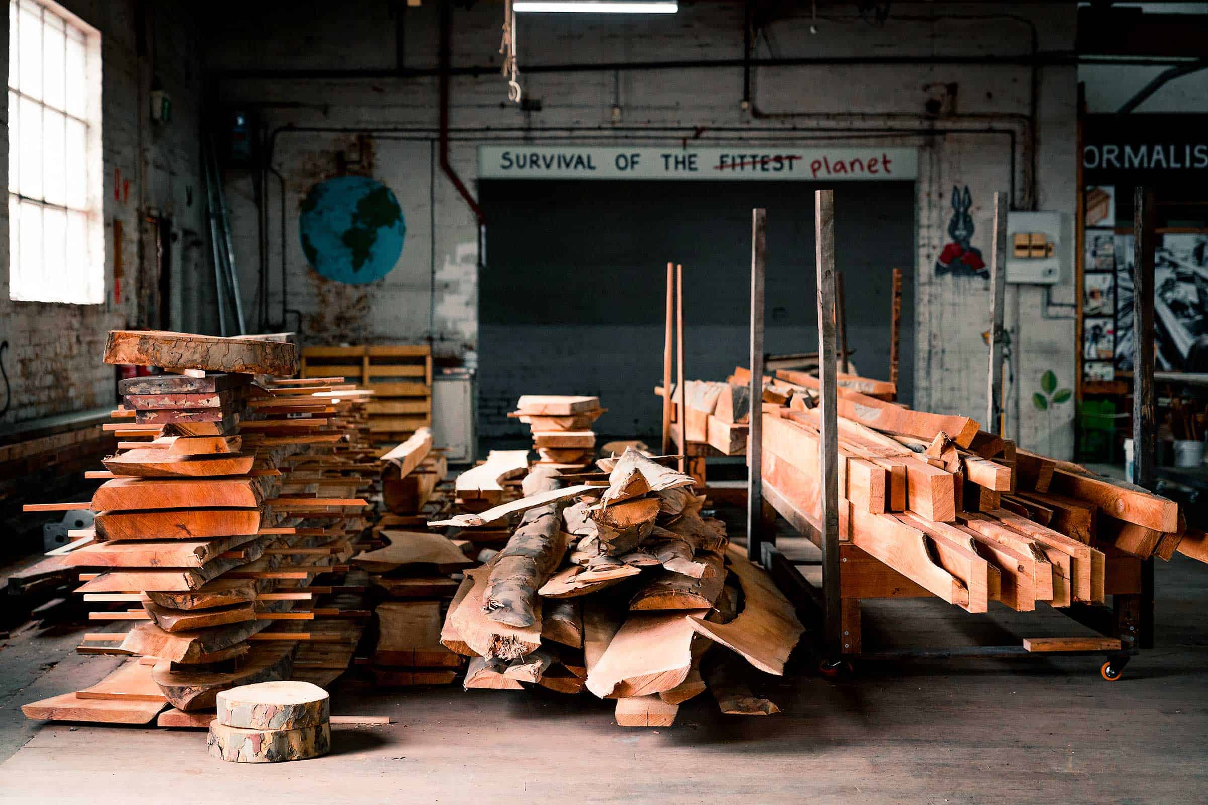
Revival Projects is an award-winning multidisciplinary building practice revolutionising the handling of existing materials destined for landfill by the building and construction industries. Faced with its next stage of evolution, the company needed to clearly communicate its impact, purpose, and what it does as team of activists. MEK worked closely with Revival to strategise, develop and design a comprehensive website and digital collateral to support its mission and communicate its purpose.
APPROACH
We immersed ourselves in the company’s ethos to gain a better understanding of the impact it wanted to make, and created a unique narrative that visually transformed Revival from a building and construction company to a world-leading changemaker in sustainable production.

Through our close collaboration, we focused on amplifying the Revival’s activist roots in order to stand out from the sea of sameness in its industry; communicating its message with clarity, boldness and confidence, embracing its uniqueness, and focusing on the change it’s making in the world.

IMPACT
The result is a strategic, impactful design outcome that transforms the company’s activism and mission; using innovative, unconventional design that boldly communicates Revival’s vision and groundbreaking impact in its industry and the world.
Explore the Revival website
“I can’t imagine a better design team than MEK for a purpose-driven brand. MEK invested in establishing a genuine knowledge of what we wanted to change in the world and how we’re able to do it; to the extent that I would describe them as ambassadors of our cause. The work that MEK produces for us is consistently effective and has elevated our communications and the presentation of our brand, fit for a global audience. We cherish our partnership with MEK and couldn’t be more grateful for the incredible work they deliver in the name of our mission.”
ROBBIE NEVILLE, FOUNDER
WWF Australia
Conserving Endangered Biodiversity
SCOPE OF WORK
Campaign Design
Campaign Development
Digital Design
Print Design
Campaign Design
Campaign Development
Digital Design
Print Design
UN SUSTAINABLE DEVELOPMENT GOALS
![]()
![]()
![]()

PHOTOGRAPHY
Animalia
Harrison Warne
Animalia
Harrison Warne
CONTEXT
World Wildlife Fund for Nature (WWF) works in the field of wilderness preservation and reduction of human impact on the environment. Each year, the organisation faces the significant task of raising awareness of the world’s most endangered species and communicating their plight to a growing audience of people who preference the cutest and cuddliest animals.

We created a campaign to raise awareness of some of the most endangered animals in Australia. We designed a series of posters, postcards and an interactive mobile site. The designs feature a graphic representation of a physical characteristic unique to each animal, with information about their home, threats, numbers and status.
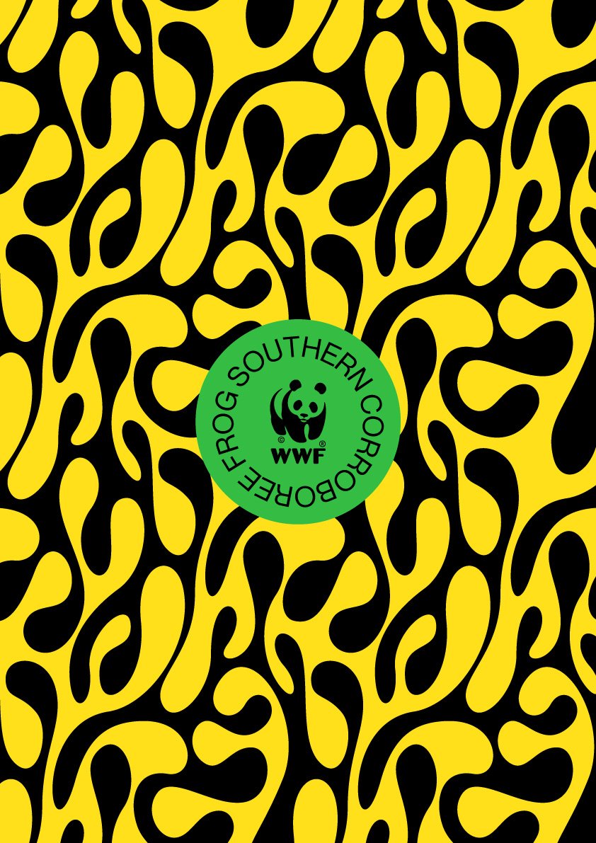
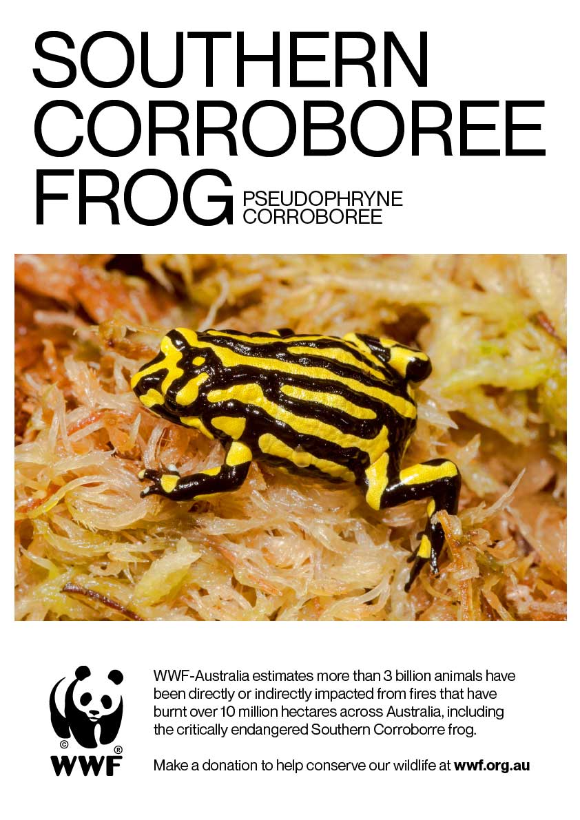
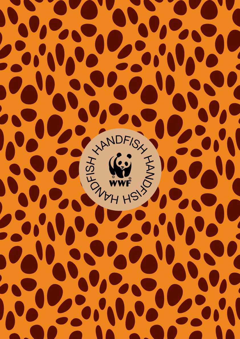
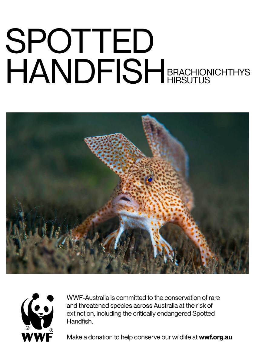
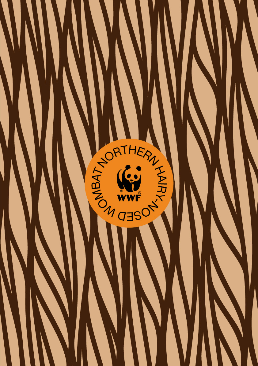

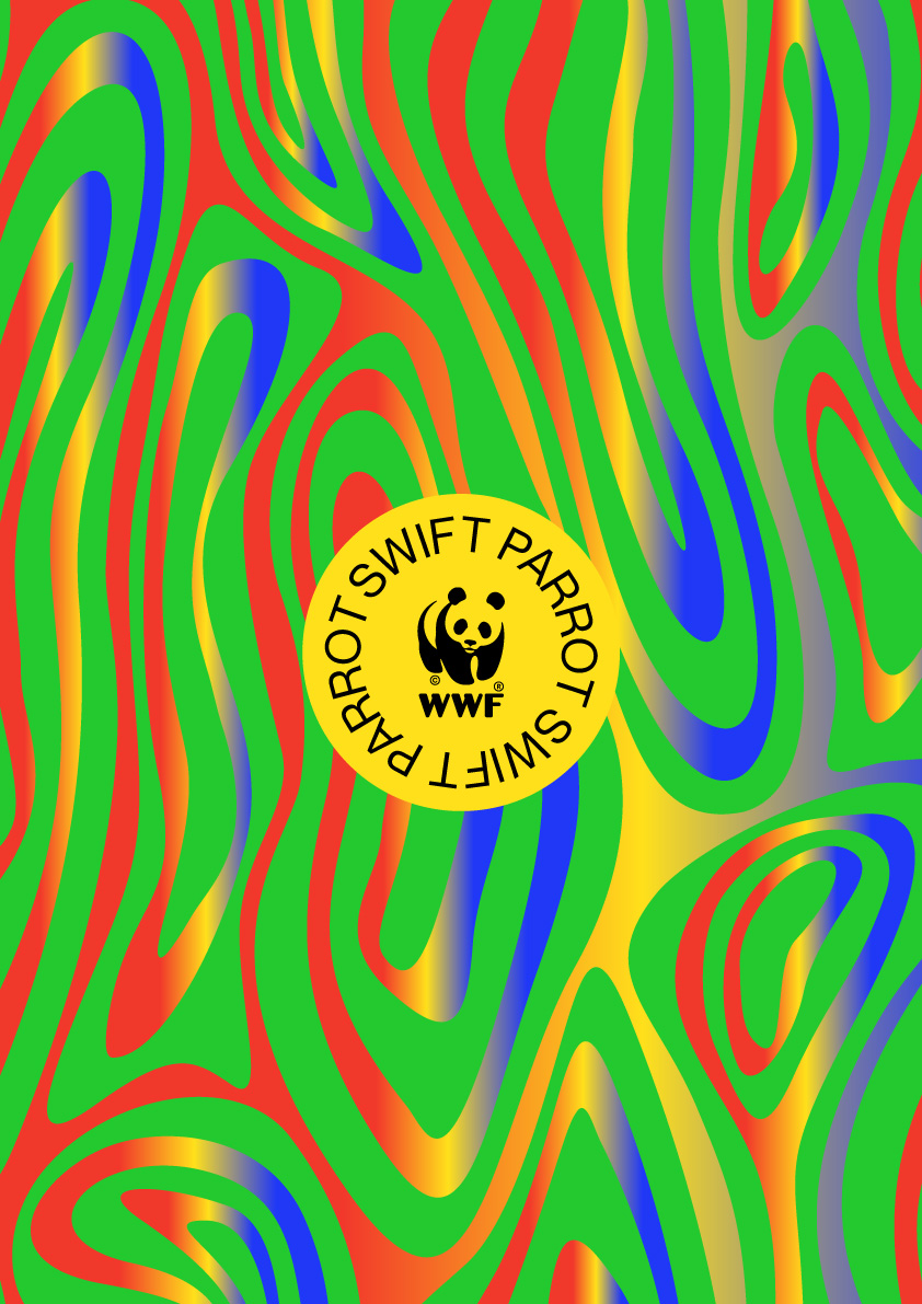

Because people tend to preference animals by their appearance, the campaign focuses on their unique colours and patterns to draw attention and raise awareness, calling for public donations to help preserve them. The result is a bold and compelling design that celebrates the uniqueness of each animal and stands out against the cluttered urban landscape of street posters and OOH advertising.


IMPACT
This campaign has successfully raised awareness of the endangered animals, particularly the Southern Corroboree frog whose numbers significantly declined after the 2019–20 Black Summer bushfires.
